
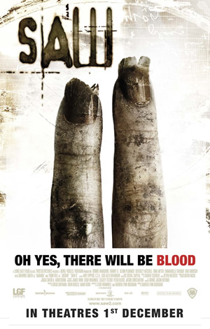
Also the main image on the posters for saw are very gory, and intense, this differs from the other posters as they usually show the masked killer, however having a ‘disturbing’ image on the front cover, which sort of tell the story is a good thing, because it would appeal to the audience in a clear way, meaning that this is a good way to target your chosen demographic.
 When looking at the image itself of the first saw poster, it shows a bruised hand with blood dripping, this immediately tells the audience that the film will be extremely gory, if that is something they are willing to show on their posters, also it shows a sense of torture which is evidentially the main aspect of the plot. The fact that the hand seen on the poster is on the floor, which looks like it is on a tiled hospital floor, this in some way can relate back to the audience, because it is in a place that we have visited some time in our life, or eventually will some time in our lives.
  This relates to other horror films because most of them are located somewhere in the suburbs, which is where the majority of the audience will be living, so this will make them feel uneasy in their very own homes. The poster does a good job in giving away just a tiny fraction of the story line away, and also because it is the first poster for saw, people would not know how the plot ends up. However given that the hand is bruised, and scarred, it implies to us that there will be some sort of horrific death, or maybe it will be nothing but horrific deaths. The fact that only the hand is seen in the poster, instantly tells us that this is the victim’s hand, however not being able to see the victims face, the audience is unable to identify who the body belongs to, so they are left feeling uncomfortable. This would be a great way of marketing because it makes the existing audience, much more aware and tempted to go and watch the film.
Through all these posters you can easily recognise the posters are of the film saw, this is because of the colour scheme set, which in this case is white/grey. This is a good example of brand identity, where the relevance to each of these posters are to be in some way related to each other and easy for the audience/viewer, to identify the similarities.
 The typography of this is fairly simple, the letters themselves are in capital letters which has connotations of seriousness and this helps reinforce the other pieces of the poster to send its message across to the audience. The letters are uneven and out of place, giving a much more horrific feeling because the film could break ALL boundaries.

 The original poster on the left has amazing artistic content; this can be easily seen in the knife which is being held by a hand, out of the dark. The knife then descends to the right, slowly changing to the figure of a pumpkin. The pumpkin has connotations of evil, and that of something lurking amongst us, the connotations can change for a pumpkin, depending on the event, as it is especially thought of as a scary object during Halloween. This in my opinion is an amazing poster for a slasher film, because not only is the knife slashing through the dark, representing the actual slasher contents, but it also has a pumpkin, which is seen all round during Halloween, portraying that the sight of a pumpkin is going to have some sort of dangerous meaning. This relates to the audience because they will feel uneasy in their very own society. Additionally this is a good marketing strategy because if the audience is to feel uneasy they are more likely to go and watch the film to ‘face their fears.’
The typography for the title; is in capitals, again this shows the seriousness and to help reinforce this are the sharp edges on the lettering which is also suggesting that this is a horrific film, the exaggeration on the letter ‘m’ can be easily referred to as a knife, or some sort of sharp object. The catch phrase in terms of typography is fancy; this shows elegance, and intelligence, also when taking into account the killer, they always seem to have some sort of power, that no matter what they get hit by, they seem to get right back up, and they do that with ease. In other words the killers in horror films are
No comments:
Post a Comment