
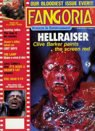
Fangoria astonishing confidence in their brand identity, that they can afford to obstruct their mast head, this means that the audience are so familiar with this magazine, that even if the title is not seen, they can identify without any trouble. This is a good sign of brand identity because the audience can easily relate to the magazine, in terms of the mast head, colour scheme and the layout. This plays an important role in a magazine because it helps sell the magazine when in stores, to existing customers, and also potential customers, also this allows the magazine to be easily recognised amongst other competing magazines. The magazine can also afford to change the font of the title, this shows the confidence level of the magazine, in terms of audience awareness. This shows that brand identity of any product is very important. The colour scheme for Fangoria is mainly red, white and yellow, with red taking up the majority of the space within the magazine. This issue of fangoria uses a contemporary star, who at the moment is very successful with what she does, and is very well identified. This immediately helps the audience relate to the magazine, as it instantly allows the targeted demographic to identify her, this in turn helps the magazine sell, and can be placed in less popular spots when being sold.


Talk about how these 2 films have colour scheme of black and yellow
which was once the old version of colour scheme to relate to horror/slasher
film movies. Horror/slasher film posters in the past had a different colour scheme to them as appose to what they have now, for example the cannibal holocaust movie poster, has a red and yellow coloured title. Furthermore they tended to consist of really graphic paintings, rather than having real life images. These had a major effect, because they allowed the audience to realise how gory the film is, however when watching the film, you would see the full extent to this.

I Spit on your Grave, is another great example, of a very extreme movie, in terms of the content, and gore. This also has use of red and yellow, and the more mordern version of this film, shows the colour scheme for an average horror/slasher film in the present.

No comments:
Post a Comment