This is our slasher film trailer, it is very formulaic considering the conventions of a slasher film.
Thursday, 3 May 2012


Monday, 30 April 2012
In what way does your media product use, develop or challenge forms and conventions of real media products?
The media product I have chosen is my slasher film trailer. All trailers have codes and conventions which they are obliged to, however some break these conventions and some set new conventions, this gradually changes, a great example for this, is that more and more videos, which are released up to date, are 3D and they mainly specialise in showing the audience what the 3D has to offer them, not what the film itself has to offer to them. Conventions sometimes followed are things like having the end card, voice over, and on screen captions. The captions help understand what is being shown on screen, but doesn't tell the full story, leaving the information gathered by the audience at a cliff hanger of some sort.
the beginning of the trailer starts off with the BBFC logo, this tells the audience delicate information such as the film name and such, most importantly it tells the audience the age certificate given to the film by the local/borough council. This is a very important shot to be using because it initially tells the audience if they are capable of watching this film or not. This also allows the audience to spot the specific production company, this sometimes has a huge impact on people, because some people usually watch a specific film just because it is directed/produced by someone they like, so keeping them aware of who created the film is a very good idea. the voice over used in the trailer is useful, once again this follows formulaic conventions. the voice over follows the trailer and gives us information about what we need to do, it matches the edits well. within our media product our voice over is that of the main character, who is made to sound depressed, because his friends are killed. So it is as if the main character is telling the story.
our trailer breaks a huge convention, this is obvious, because the killer is actually a feminine figure, and the final girl is evidently a final boy. Within our trailer there are many theories of narrative that can be applied;Vladimir Propp studied hundreds and hundreds of Russian folk tales, to realise that there are eight main types of characters, these are; the hero (seeks something), villain (opposes hero), donor/benefactor (helps the hero by providing magical gift/object), dispatcher (sends the hero on his way), the false hero (falsely assuming the role of hero), helper (gives support to the hero), princess (reward for the hero but also needs to be protected from villain), and the father. Although these aren’t exactly the types of characters in films, they are somewhat similar, and the concept can be seen as the same. The hero will always be someone who is sad/uneasy with themselves, due to some sort of bullying in their childhood. Wanting to break free of this sadness, they go out on a quest to find meaning. To assist them is the benefactor, who will give some sort of magical gift/object to the hero, to help him on his journey. (Star wars – Luke is trained in the force, gains lightsaber. Spiderman – spider bites hero). Within our narrative there is no specific hero, however the benefactor gives information about the situation to the ineffective authoritive figure.
The final girl in our narrative does not exist, instead we have chosen to have a final boy, this will challenge the codes and conventions of the narrative, and because our society is not as male dominant, it allows the female figure to look as if she is in full control, and we have also used the male gaze on the male figures throughout the narrative, which will help reinforce this meaning we are trying to convey – the society that we live in now is not as hegemonic as it used to be.For the trailer, we were required to make a full movie plot, so that we knew what the trailer would consist of, rather than adding in bits as we go. For the plot we decided to break some codes and conventions, we did this by making sure that the girl is the killer, and this will be made very clear so that the audience recognise what we are trying to do.
This will cause more suspense between the audience and the movie, because the characters themselves do not know who the killer is, and the audience does, so they will feel ironic sympathy towards the characters within the film. Also we have made the main killer, a mousy, brunette girl, and this again breaks the codes and conventions of a typical horror movie. The message behind horror/slasher films usually tend to be, that sex is bad for you. To reinforce this, the knife symbolises sexual contents, and usually the blonde, sexually active girl is the one to die, and she is killed by the knife which is mostly held by a male figure. We could easily create a new message behind our movie, because we chose to break the codes and conventions in a specific way.
The message we are conveying over to the audience is that, ‘if you take a girls virginity, she will take your life.’ Not technically, but in a way that, you could get her pregnant, or you could end up in a bad place because of this event. When thinking about the society which we all live in, which is a little patriarchal, which intends that males have more power over women, which in some cases is true. Our trailer will portray the message out to the audience that having sex before marriage, or just for the sake of it, can lead to serious conclusions.
We have also given the girl the power, so that means that girls are more dominant than men, when thought about within this film, or they are equal, and just doing what is right. This also shows that just because a girl is a mousy, nerdy girl she is not to be taken advantage of, as at first she is seen holding books in our trailer and then she is holding a knife, which will get the message out loud and clear. Also the location of the movie, is in a suburban area, which is an ideal place to take into consideration when making a horror/slasher film, mainly because so that the audience can relate to this. The majority of the demographic would live in an area like this, and so they do not feel safe at their own home.
Given that of the props, we have decided to make the killer have some sort of obstruction to her face; this will create tension between the audience and the film, because they can then portray their very own fears onto the figure on screen.We are also planning on using some elements of German expressionism, which is the effect of using lighting to create mood and tension. It is not the lighting itself but the shadows created from the lights. Using the light at different angles create sharp ragged shadowy shapes which allow the character to be seen with a lot more consideration, great example for this, is ‘Psycho’ where the killer, is seen standing, with shadows on the floor, which do not look normal. This makes the audience think, and so that the character is portrayed in much more detail. You can almost get an instant judgement towards them.We have taken into consideration of Vladimir Propp’s theory. Which are basically that there are always 8 types of characters, these are the benefactor, the villain, the hero, the ineffective character, etc. These characters can easily be identified within the majority of films, the benefactor is usually an elderly person, which gives advice to the youth, however obviously the youth do not take the advice being given by the benefactor, and then realise they were wrong to choose otherwise.
The villain always in some shape or form will always have an obstruction to his face; this is because it creates tension between the audience and the product. The reason behind the mask or scars or anything obstructing the face of the villain is to create an effect that the audience can then interpret into their very own image. They see their worst fears behind the mask, on the subject.Iconography plays a big part in the film, because as explained before, the villain in a horror film will have a knife, and this has representations of sexual contents, and for our trailer, we have chosen to keep this, mainly because it breaks the usual codes and conventions, the main character in our film is a girl, who is the villain.
We have decided to subvert some more of the codes and conventions of an average horror/slasher film, in order to do this, we have chosen not to give her a mask, this is to create an ironic sympathy, the audience will know who is the killer however the characters within the film will not know who the killer is, and because at first she is sweet and innocent, the audience can also then relate to that.Within our trailer when talking about sound, the majority of the trailer will contain diegetic sound; however we will also have some elements of non-diegetic sound. We will also be using the ‘hand held camera’ style for some parts of the trailer; this is to create a shaky effect. This will immediately give the trailer some intensity, as it looks like a point of view shot, and not shaky means that it is like watching from the view point of someone else, as this will put the audience in the shoes of the killer or the victim. For the non-diegetic sound part of the trailer, we will have some eerie music playing in the background; this again is to help the intensity of the trailer. We have also thought about the camera angles, in ways the shots we have taken, this has a huge impact on the representation we will portray on each of the characters. Having the girl in the shot from above, makes her look small, however we will then take the shots from below, giving her huge power, and letting the audience consciously know that she has gained a dramatic amount of power.
The killer in our trailer is first of all a female figure. This already twists the codes and convention of the usual slasher film. This will cause more suspense between the audience and the movie, because the characters themselves do not know who the killer is, and the audience does, so they will feel ironic sympathy towards the characters within the film. Also because our society is Patriarchal, in which the male gender acts as the primary/dominant authority figure central to social organization, and where fathers hold authority over women, children and property. It implies the institutions of male rule and privilege, and entails female subordination. The majority of the audience will be relating to this, if not all. Also the fact that the girl is taking control of the situation will challenge the audience sub-consciously; this will also help keep the tension rolling for them. This will all seem new to them, because of the patriarchal society we live in. However we have also chosen other ways in which we can get the audience’s attention, the fact that the girl was at first depressed and caused to become a killer, will help do this. The message behind horror/slasher films usually tend to be, that sex is bad for you. To reinforce this, the knife symbolises sexual contents, and usually the blonde, sexually active girl is the one to die, and she is killed by the knife which is mostly held by a male figure. We could easily create a new message behind our movie, because we chose to break the codes and conventions in a specific way. The message we are conveying over to the audience is that, ‘if you take a girls virginity, she will take your life.’ Not technically, but in a way that, you could get her pregnant, or you could end up in a bad place because of this event. When thinking about the society which we all live in, which is a little patriarchal, which intends that males have more power over women, which in some cases is true. Our trailer will portray the message out to the audience that having sex before marriage, or just for the sake of it, can lead to serious conclusions.
We have also given the girl the power, so that means that girls are more dominant than men, when thought about within this film, or they are equal, and just doing what is right. This also shows that just because a girl is a mousy, nerdy girl she is not to be taken advantage of, as at first she is seen holding books in our trailer and then she is holding a knife, which will get the message out loud and clear. Also this is something the audience can relate to, because our audiences, who are 18+, will definitely know or encountered someone of a similar status to that of the killer in our trailer at some point in their lives.Given that of the props, we have decided to make the killer have some sort of obstruction to her face; this will create tension between the audience and the film, because they can then portray their very own fears onto the figure on screen. Usually this is done via a mask and scars, we have chosen to use makeup, because the killer is a girl, and the makeup is normal to her, also reinforcing the fact that women are seen as monstrous at points, which can also be linked in with the Male Gaze. To help reinforce this, we can also take into consideration of Barbara Creed’s theory, in which she states that women are seen as monstrous. In the majority of horror generic films, monsters usually tend to be seen as a male figure, and the women are usually seen as ‘mans castrated other form from the Freudian position.’
We are also planning on using some elements of German expressionism, which is the effect of using lighting to create mood and tension. It is not the lighting itself but the shadows created from the lights. Using the light at different angles create sharp ragged shadowy shapes which allow the character to be seen with a lot more consideration, great example for this, is ‘Psycho’ where the killer, is seen standing, with shadows on the floor, which do not look normal. This makes the audience think, and so that the character is portrayed in much more detail. You can almost get an instant judgement towards them.Iconography plays a big part in the film, because as explained before, the villain in a horror film will have a knife, and this has representations of sexual contents, and for our trailer, we have chosen to keep this, mainly because it breaks the usual codes and conventions, the main character in our film is a girl, who is the villain. We have decided to subvert some more of the codes and conventions of an average horror/slasher film, in order to do this, we have chosen not to give her a mask, this is to create an ironic sympathy, the audience will know who is the killer however the characters within the film will not know who the killer is, and because at first she is sweet and innocent, the audience can also then relate to that.
Within our trailer when talking about sound, the majority of the trailer will contain diegetic sound; however we will also have some elements of non-diegetic sound. We will also be using the ‘hand held camera’ style for some parts of the trailer; this is to create a shaky effect. This will immediately give the trailer some intensity, as it looks like a point of view shot, and not shaky means that it is like watching from the view point of someone else, as this will put the audience in the shoes of the killer or the victim. For the non-diegetic sound part of the trailer, we will have some eerie music playing in the background; this again is to help the intensity of the trailer. We have also thought about the camera angles, in ways the shots we have taken, this has a huge impact on the representation we will portray on each of the characters. Having the girl in the shot from above, makes her look small, however we will then take the shots from below, giving her huge power, and letting the audience consciously know that she has gained a dramatic amount of power.
We have taken into consideration of Vladimir Propp’s theory. Which are basically that there are always 8 types of characters, these are the benefactor, the villain, the hero, the ineffective character, etc. These characters can easily be identified within the majority of films, the benefactor is usually an elderly person, which gives advice to the youth, however obviously the youth do not take the advice being given by the benefactor, and then realise they were wrong to choose otherwise. The villain always in some shape or form will always have an obstruction to his face; this is because it creates tension between the audience and the product. The reason behind the mask or scars or anything obstructing the face of the villain is to create an effect that the audience can then interpret into their very own image. They see their worst fears behind the mask, on the subject.
What have you learnt from your audience feedback?
Once we finished our trailer, we showed it to students in our sixth form, and friends using social networking sites, we then asked 25 people questions about the trailer being shown. the demographic we introduced our trailer to were mainly the ages of 17 and above, to make sure that this questionnaire would not be biased in any way, we made sure that we knew what these people liked and disliked, some of these people did not necessarily watch slasher films, or even did not like slasher films as a genre. this was done in order to make this as fair as possible. Four questions were asked to each of these 25 people, and this allowed them to be all qualitative and open ended questions, so that we could gather both, criticism/negative and positive feedback.
Once I posted my media product on social networking sites, such as Facebook, and YouTube, I instantly began to gain amazing feedback. However there lacked one very important piece to the answers I was receiving, and that was that they were somewhat biased, because these viewers were mainly friends, and they wanted to please, so they gave answers to please. So we decided to ask the following questions;
- What did you understand from watching the trailer?
- Are you able to relate to any of the characters and why?
- How much more tension does the music add to the trailer?
- Does the trailer end with a surprise? and does it help add fear within the trailer?
This is so that they would feel that they were wanted to make honest opinions, whether they were negative or positive. looking at the first question;
- ''What did you understand from watching the trailer?''
The reason we had asked this question was so that we were aware if we gave away too much of the narrative. this would mean the trailer was unsuccessful because the audience after watching the trailer would not pay to go see the film, as they would feel it has nothing to offer them.
- ''The trailer tells me what the film is about, however while telling the story, it builds up tension and then drops it. the trailer does this occasional and I feel the need to want to find out now!!''
This is a very well and full feedback. from this I took away that the trailer did a really good job, in terms of keeping the audience on edge, however the plot was slightly over revealed, as we had included most of the killing scenes in the trailer, and there is no extra bits to the trailer, in consideration of extra scenes of characters looking worried and exploring the events. this would create additional tension and allow the killing scenes to be more spaced. The way in which we did our trailer, gives a sense of feeling that the film could only consist of killings, which is in fact wrong. So this is something we could improve on.
- ''Are you able to relate to any of the characters and why?''
The main reason we asked this question, is that because, it is important for the audience to be able to relate to the characters on screen, if not relate, at least be acknowledged of these kind of characters. Just like the location, which is a suburban location, this is so that the audience are able to relate to the location, so that they would feel some what uneasy in their own homes. the main aim for a media text is to create a bond between the character on screen and the viewer, the age group for the target audience, is more or less the same age as the characters being shown on screen.
- ''In a way I could relate to this. I myself have been involved in a situation like this, where I have felt used, and resorted to revenge. Even though it is not the right thing to do. while watching the trailer I was made aware that she was mad at a boy, and the cause for this, was the boy himself. I also began to generate sympathetic feelings towards her, even though what she was doing was wrong.''
This response tells us exactly what media texts, need to do, to subconsciously gain the viewer, either by sentimentally attaching the audience by feeling, or by thrilling suspense. This response was given by a female, I have chosen both males and females to ask the questions to. this is because then the results will be as fair as possible. 'A Perfect Get Away' is a film about two killers, that go out to an isolated island, and they are the serial killers, however because we know so much about them as an audience, we do not think it can be them, because we see the film from their perspective we think that they are innocent. However nearing the end of the film, we see another point of view of the story from one of the other couples in the film, and this immediately changes our views on them from negative to positive. Also 'Natural Born Killers' is a very good films in terms of flawing the audience, these two couples, are psychotic and even though they are viscous and aggressive, we are left to love them, this is done very smartly, because they are madly in love.
The same question asked to a male and the answer was somewhat the same, - ''I understand the boy's position and the girls position, because when a boy, who is in a relationship makes a mistake, the girl is not easy to forgive.'' this tells me that both the male and female audience can relate to some or if not all the characters, meaning the trailer is fairly successful in my opinion because we have created a bond between the characters on screen and the audience.
- ''How much more tension does the music add to the trailer?''
The sound plays a very huge roll in the trailer, because it helps convey meaning, and initially tells the audience what to do and how to react, on a subconscious level. for example when watching a trailer, and the music begins to get all eerie, you instantly expect an interesting event to take place.
- ''I loved the music, it helped me understand what was happening. It actually made me aware of things that were about to happen. the sound in my opinion added a lot of value to the trailer.''
This tells me that the sound was a very important piece, to the trailer. I decided to watch the trailer once without sound, and the next with the sound, I was astonished at the difference, even though I had heard what it was like with the sound, when I played it without the sound, the trailer had almost halved in value, maybe even nullified, compared to the one with sound.
- ''Does the trailer end with a surprise? and does it help add fear within the trailer?''
I asked this question to find out if the trailer was in effect, any good at all. the response for this were very mixed, this is one of the twenty five results for this question;
- ''It makes me worried, because it is sudden and a by the end of the trailer, I made like a friendship with one of the characters, and when he was in danger, I feared for him, but it didn't show what happened to him next, so I was left at a cliff hanger. Really good marketing strategy!''
This response tells me that we did a good job with our trailer, and the audience are able to both relate and understand the narrative, without giving away too much information, leaving our potential customers on a negative side. However this also tells us that the montage sequence, when the tension really builds up, was very intensive and it had a good effect on the demographic.
I have gained a lot of feedback from the people who answered my questions. This has pointed out the positives and negatives within the trailer, and one important thing I have taken away from this, is that the sound, and edits should match, because it helps represent the meaning, that I was trying to portray. Also the importance of portraying fear into the audience, is very important, because that if you can get the audience to feel the way you want, then they are practically in your hands. Allowing you to eventually 'play' with them. The use of characters, and the characters on screen's social status also appeals to the audience, once again allowing the audience to be able to relate to them. However we could have made improvements to the media product, one of these improvements is that we should have had 'Point of view' shots, allowing the audience to be in the shoes of the character on screen. this would in some ways 'force' them to take place of the character.
How did you use media technologies in the construction and research, planning and evaluation stages?
This is an evaluation of how media technologies have helped me in the construction and research, planning and evaluation stages. This essentially tells me what to do, how to do it, and understanding it. Also how my use of media technologies have improved over the two year course.
The main use of media technologies was the internet, I used this for all sorts, such as planning and researching, editing, formats and distribution. To go into more detail I used a site called logomaker.com this was used for my brand identity, the 'MADS Production' logo, which I then converted into Photoshop and edited it to make it look more smart. The use of these two media technologies helped me with the outcome of my media products. The internet also allowed me to view existing forms of media, and from this, I could relate to the conventions of formulaic media products, and if I chose to, I could have broken ones which I felt were necessary. This is where I used the research and planning aspects to the construction of my media products, after I made quick templates for my media products, I gave them out to people to show them how my final piece would look, I then took down their answers, and applied the changes I needed to improve my product. I used a piece of technology called Question Pro, which had a huge impact on my products, because it was a very simple and quick to use software. I could just send all my friends the questionnaire, using Facebook, and they would then click on the link, answer a few questions, click 'okay' and this would immediately be changed into all sorts of percentages and graphs, this saved me a lot of time because I did not have to worry about doing all the maths and technical bits.
The use of technologies for my media products were varied, for my poster and magazine I used a programme called Photoshop, while observing others existing media products relating them to mine, playing with the conventions, media technologies really do play a huge role in the construction part of my media products. For the main media product, the trailer I used Movie Serif Plus. This was a basic and fairly easy to use. We used the recordings we got from our camera's which were then placed onto a hard drive, which was then linked up to our computers, ready for us to experiment with, with all the recording clips. Using this programme was a very useful thing mainly because, raw recordings when put onto another media platform to show, came out different as to what it was on the camera's. So to avoid this problem, whilst editing the shots, we adjusted the brightness and contrast, to match each other, because some shots were taken in broad daylight, and others with artificial lighting. However for the guide trailer made up of the story board sheets we drew up, we used another programme as a posed to Movie Serif Plus. This is because it is much easier on this specific programme to just add in all the still images, and sort them out in the sequence we wanted, and then once finished, match the sound over the editing. We used an existing sound track, which we found on the internet, this was all in order to just help us as to what the final product should look like, more or less.
For the evaluation stages, I showed the trailer in person, to students in my sixth form, which consisted of about 60 people, we then gave out questionnaires to some, and asked for honest opinions, after the takings of this research stage, we posted up our trailer on our individual Facebook accounts, which meant that we opened up the audience to a much more wider one, because we all knew different people, and some the same, of all ethnicities, and all genders. Ethnicity is an important factor to this, because if an individual is raised up differently than others, they will see the trailer as different, and they would give us the vital information we need, to improve our media product.
Wednesday, 25 April 2012
How Effective is Your Main Product and Ancillary Texts?
The media products we have made during the course, were all in order to help each other out, Looking at my main media product, the slasher film trailer. the ancillary texts play a huge role in supporting and advertising this media product, the ancillary texts was the slasher film poster, and a horror magazine front page. Both of these work together in order to help the main media product, because they both have different demographics to each of their own. This would allow a wider variety of targeted demographic as a whole.
All of the media products, both ancillary and main, should have some resemblance. Brand identity is key to this, because when seeing all three media products, they need to know that it is the same product, so that they know the importance of it, rather than thinking the opposite. The audience must be able to relate to this, and quickly adapt this to their lives.
Distribution is key for media products, because they need to be in the appropriate places, for the targeted demographic to see it. Different areas have different kinds of people, such as in a local area of mine, South Oxley has very few young people in it, and this would mean, if we were to have a poster or a billboard based in this area, it would be a total flop. Also if we had a bus that went through this area, it would also make no sense, because the people there, would not be wanting to see this film, as it could look atrocious. So basing the areas is a very important factor to distribution and advertising, also on television, there is not point in showing the trailer on screen, at some time during the day, on weekdays, as most of our demographic would be at school or at work. Using social networking sites is a very fast way of getting well known in the media world, because as seen from our main media product already, we have posted the trailer on our groups Facebook walls, there were four of us, so that would mean we showed it to a huge variety of people as we all have both same and different friends. the video reached almost 200 views in 2days, and this gradually increased, because people used the 'share' link for our trailer, and they decided to show it to more of their individual friends, meaning the audience for our product immediately gained popularity. People all round the world could have seen our trailer in just a short amount of time, because I know for a fact, a small minority of my friends are living abroad, and so that if they decide to share the trailer, we would gain tremendously. Also this being an independent product, we do not have much money to distribute the product, the use of word of mouth, through social networking sites, is a very smart way to distribute, if the trailer is like by many, and it goes viral, there would be a buzz to go and watch the movie, leaving us with a huge audience, and profit, as we would have spent very little in the first place.
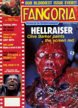
The ancillary texts help the main product substantially because it allows more understanding of the characters, such as the poster, the main image is of the girl who is made to look angry, so the audience then instantly know that she is the main character and possibly the killer within the narrative. The magazine helps with the main product as well because on the magazine I have added in extra shots of the other characters within the plot, so that the audience can know more about the characters, and the use of buzz words on the magazine, draws the audience closer and closer, to the brink of buying the magazine. Fangoria was a great magazine to use, for our media products, because Fangoria is a very well known magazine, aimed at all kinds of demographic, but mainly horror/slasher movie fans. This gives us an instant advantage to the distributing of our film, becuase usual customers for the magazine used, would buy the magazine because they are aware of the information/entertainment it brings to them, regardless of what is on the front page. Confidence in the magazine can be proven as in most cases, they can afford to obscure their mast head in some shape of form, and this tells people instantly that the magazine is very successful, and you would be able to recognise it simply by the form of its status, its layout and colour scheme. I chose to stick by the colour scheme's for their magazine however, changing it a little.
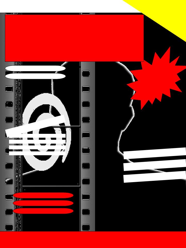
In conclusion our media products, all have a colour scheme they abide to, the poster is white, black and red, mostly which has mixed connotations, white of purity, black of death, and red of blood, almost telling the story, relating to the characters. innocent girl, is forced to hate someone, she then becomes the killer, and blood is shed. Subconsciously telling the audience the representations of the characters. the end card on our trailer has the same colour scheme as our posters, this would help with brand identity, because if it was completely different, they would not help each other out in any way, but it would leave the audience confused.
Genre Analysis
The horror genre seeks negative emotional reaction by the audience by playing on their most primal fears. Slasher films are amongst the many sub genres within the horror genre. Slasher films tend to consist of extremely gory killings/events.
Formulaic slasher films, have a male figure as a killer, and he is holding a knife, to represent a penis. The narrative usually implements that the girls within the film are sexually active, and these are the girls which die, portraying a message which tells us that sex is essentially dangerous. However to reinforce this message, the mousy, nerdy girl, who is also a virgin, is attacked by the killer, but she conquers past this, and she either kills the killer. In our slasher trailer the knife is not in any way represented as a penis, but it it representing the female figure as monstrous. This links back to the Marxist theory, the monstrous feminine, based on Freudian psychoanalysis - Barbara Creed. Also to reinforce to this, the fact that the killer is defeated by the virgin girl, tells us that, the person we saw with a motherly figure, has now taken over the villainous character.
Our slasher film does exactly what current films do, multiple killings take place, we have also broken a convention by making the killer a female figure, who became this way after losing her virginity, this is all to keep the audience on edge.
Within our narrative, because the killer is that of a female figure, the knife cannot be represented as a penis, because it would not make sense, but instead it is represented as a symbol of revenge. Because the character loses her virginity, and the boy who took her virginity tells her it meant nothing, this angers her and she is forced to become the killer because she see's no other way.
Iconography within the film is fairly that of the same compared to other films within the genre. Examples of this are that our trailer consists of the typical locations, which would be found in more formulaic films. The use of an urban scenery to base the narrative in, relates to the majority of the audiences, so after watching the film, they would feel a little uneasy in their very own homes. The clothing worn by the different characters within the film are wearing casual clothing, such as hooded tops, jeans and trainers. The colouring of their clothing also helps to shoot across their roles, and representations. For example the killer is wearing black, which has connotations of darkness and evil, and one of the victim is wearing a light blue hooded top, which has connotations of peace, and serenity, helping him come across more as a helpless victim.
Monday, 23 April 2012

Slasher Film 'INTERVENTION' Call Sheet

This is a call sheet, we were advised to use this, and this helped us greatly. Mainly because we knew what we were doing, and when we were doing it. Also we had a clear indication of the character we would need on the specific day. This call sheet also allows you to shoot your film not sequentially but in order by the location, this was a grave deal for us, because this allowed us to keep it quick and simple rather than running round in circles doing shots in order.
Slasher Film Magazine
This is the stages in which my media product (magazine front cover) was created.

I started off with the basic images, without any cropping done to them, or edits what so ever.

I then moved on to cropping out images I took, to put into the reel, which would evidently consist of all my featured stories.

I then started adding in the blood effects, to make this a slasher film related magazine front cover. I then experimented with all the different places I could place the blood effects, to make it look gruesome, however not too much that it would overload the page, and prevent writing to be placed.

After placing in the photos for the featured stories, I decided to start on the tag lines and featured stories, I chose the main story to be called 'Sweet Revenge' the typography of the word sweet is quite fancy, and also pink this makes it a very feminine icon, however when placed together with the word Revenge, in red, with sharp, frigid edges, it gives the meaning a whole new level. It helps tell the story, and also emphasises that this female figure is not to be messed with.

Later on I decided to start cropping out the main image, to try and get a more colour contrasting back ground. and also fitted in a banner at the bottom, which would be a sense of additional incentive. Although the audience will not gain an object of some sort, they will have 'THEIR' opinion published on the website/magazine, which is much more of a greater deal in some cases. This would help boost sales, because you are targeting the audience personally, and by mentioning strong words such as 'YOU' helps to do this.

I decided to go with a colour scheme of black, red and yellow and white for my magazine, this is somewhat the same as that of the official fangoria magazine. The magazine used yellow, as a replacement colour of red, because in the not to distant past, yellow had connotations of death, anger... that of which red now has to newer generations.


My magazine media product is very much like that of the normal fangoria. I have kept most of the conventions formulaic to fangoria, such as the mast head, which is exactly that of the official product. Considering the mast head it is covered in blood, I have tried to obstruct this, to give some confidence to the magazine, as it would be seen to have so much confidence that even if the mast head is in someway small or big obstructed, and still easily recognisable. This proves that brand identity plays a very huge role within a media product. It actually allows the media product to be recognised easily.
To tempt the audience to buy this magazine, I have not only an additional incentive, but also a way in which individuals could get their word in. Seen above, I have the word 'YOUR' in the banner at the bottom, which takes things to a personal level, relating to freedom of speach, and opinions. This would subconsciously make the audience be able to relate to it easily and more effectively. Also the main additional incentive is very formulaic, because many magazines in the past have given out posters, other forms of additional incentives are, CD's, music downloads, vouchers/coupons...
The main selling story is the biggest of all of the featured story tags. This is to state it's importance, and to let you know that it is what this specific issue has to offer.
The featured story tells you what the stories are about, however they give no information away, giving the audience the urge to buy this media product and find out for themselves. Also the images, help support the individual tag lines.
The use of blood used, is not overloading the page, and it gives the product a very gory effective, making the audience feel strongly about this new film being featured.
Slasher Film Poster


The reason I have emphasised quite a lot on the blood is that, it immediately helps convey meaning of both narrative and genre, essentially it tells the audience subconsciously
Wednesday, 11 April 2012
The Monstrous Feminine
Barbara Creed
This is a Marxist, feminist theory based on Freudian psychoanalysis - Barbara Creed. The monstrous feminine contradicts the Male Gaze, where women are seen as weak/submissive.
The patriarchal side of view is that we hate our fathers and love our mothers. We wish to be in charge, replace our fathers and be the dominant figure, and you are almost one with your mother. Mother and child (Male).
However our mothers are physically different from us. They have a lack and so society views women as threat of castration. therefore they are seen as horrific/dangerous.
When we notice the lack, we grow apart from our mothers, meaning we psychologically stepping back from our mothers, and so we grow out of the pre Oedipal space, in order to move one.
Creed suggests that this is evident within some horror texts. The representation of the final girl is influenced by this lack. The final girl is not overly feminine, however not masculine either.
Equal status is given to the girl and the monster, by simply giving them both equal space within a frame, in a single shot.

Man's fear of birth. Examples from Alien, Alien emerges out from a male figures stomach. This helps represent women as monstrous, because they undergo something along these lines, during the event of giving birth, also the alien grows inside the body, just as a baby would inside a woman. Another example from the film Alien, is when the monster is pushed into the air lock, in a space ship (Sometimes referred as the mother board) which is then opened by the woman, making the monster exit the spaceship, which can also be symbolically referred to giving birth. The woman defeats the monster who is trying to harm her, and also the monster carries the threat of castration, which is now taken over by the woman, so the woman now seems to carry threat of castration.
Within our narrative, our final girl symbolises a mousy, nerdy, brunette girl, not too feminine but also not masculine in any way. However when she under goes a sexual event, she becomes monstrous (The event that could lead to giving birth). She becomes monstrous herself, at some point in our trailer, we have given the girl/killer (monster) equal status within a single shot with another girl/boy, to emphasise on Creed's theory, we have also chosen to break conventions by making our killer a female figure, and our final girl is in fact a male figure.
Summary of Barbara Creed's Theory Which Women Are Seen As Monstrous Within Horror Texts.
- The final girl is seen as a motherly figure.
- We the male audience desire to return to the pre Oedipal space we grew out from.
- Disrupted by monster/killer trying to kill the final girl.
- the final girl eventually kills the monster/killer. Usually with a knife, within horror texts.
- This leaves the male audience no where. They are subconsciously confused as to how the final girl now appears to be the monster, she is now considered abstract/horrific.
Tuesday, 3 April 2012
Analysis of Existing Media Trailers
QUEEN OF THE DAMNED
HALLOWEEN (1978)
This trailer starts of with the image of a pumpkin, which is seen on the poster for this film. It is an image of a hand which is slowly faded towards the right, to make it look like a pumpkin. This has a major impact on the audience because instantly they can recognise the two icons, the knife, and the pumpkin. The knife obviously represents death, and the pumpkin is instantly identified as Halloween, where people dress up as scary figures to go round and gather candy from people known as 'trick or treatinf.' The voice over in the first few seconds read out; 'THE ONE. THE ONLY. THE CLASSIC. HALLOWEEN.' in a spooky tone, which is echoed for more effects. after this the trailer jumps straight in to clips from the film, in a non-linear format. The sound here is very eerie and it helps with the tension, the trailer starts of scary with some tension and then raises the tension, however most formulaic trailers nowadays tend to drop the tension before the end of the trailer, like 'Queen of the Damned' spoken above. This trailer specifically does not drop the tension, as it could suggest that the killer is STILL out there. Once again helping the audience relate to the film. Other ways the audience can relate to the trailer is by location, this is set in the suburbs, just an ordinary town like the majority of people, so that when watching this film the audience will feel uneasy in their very own homes.
At the very beginning of the trailer, the shot used, is a Point of View shot, this immediately puts the audience in the shoes of the character on screen, keeping the audience interacted with the media product from the very start. After the character enters the house, and then edits out into a shot with a mask over the screen, frantically stabbing a victim, whose screams can be heard, diegetic sound is used here. The character then leaves the house, and the characters father removes the mask. Seen under the mask is a young boy, still holding the knife with a very spooked out face. At this point the audience is probably feeling uneasy, as they have technically just committed a murder. This also evidently introduces the main character, known as 'Michael' the shot used to introduce this character is a steady shot on the main character, medium to far shot, and it is kept on the character for quite a while, to let it all sink in to the audience.
After this event, once again the film name is mentioned. This is used to break the tension, however it is built back up immediately, by having the ineffective authoritative figure dish out information on the main character, and how he tried for many years to keep him behind bars, and then several other years trying to control him, 'because he realised what was living behind that boys eyes was simply evil.' The final girl in the trailer is seen with the killer behind her, approaching from the dark, this is a form of seeing the feminine figure as monstrous, and the fact that they both share equal amount of space within a shot, shows that they are somewhat the same. This in fact is true, because the final girl is forced to fight, and she uses the same knife the killer had, to attack the killer himself, and if the killer is killed by the final girl, who is made to look like a motherly figure, then she is seen as far more monstrous than that of the killer himself.
SAW
This trailer is a very unusual trailer, and in terms of conventions it breaks almost all of them, first of all, the trailer it self does not focus on introducing the story line to the audience, but it focuses on promoting the film through the fact that it is 3D. The fact that 'Jigsaw' the main character, reaches out and grabs one of the audience members, puts the analytical into perspective, about how point of view shots put you in the shoes of an individual character, this in turn does the same, effectively more, and because 3D is still something quite new to us, it is very effective in letting the audience now that this is a NEW experience, and that 3D could be the start of a new era.
Wednesday, 28 March 2012
Magazine Front Cover Templates


These are potential design ideas for my magazine front cover, and I have chosen colours which
are appropriate with my demographic and also in relation to my movie trailer. I chose these
colours in specific because they all have connotations in which I can link to with my trailer.
Firstly black has connotations of darkness and death. Red has connotations of anger, danger.
Poster Templates


Shown above are the templates for the design of my movie poster. I have taken into consideration the colour scheme, this must help sell the media product, also in terms of the conventions of a movie poster, I have not done anything out of the ordinary, however I have experimented the different styles I can use in terms of the placement of the individual texts.
Tuesday, 27 March 2012
Synopsis of Slasher Film
Brief
This is a Synopsis of our slasher film, we have plotted out the whole film, so that we can become familiar to the plot rather than just adding in random shots to our trailer, which could make things confusing. This is more or less the base line, of our end product.
Synopsis
It all starts off with a group of class mates having an unofficial party to celebrate their last year in college together, this takes place during the night, in their local park/woods. Things seem to start off smoothly, as you would expect from any normal party, the promiscuous girls within the group are partying hard and the one mousy, smart, nerdy girl is taking it easy. However the main character confronts the girl, and they talk. They're having a nice night and as they are drunk, they don't have full control of what they are doing, and they also find it hard to remember what happened. Up until the next morning, when the main character (Digvijay) thanks the girl for a great night. The girl (Raquel) being a virgin asks herself if she did this, and so she consoles in her friends, and they all say that she did. Nobody is sure what's going on, so the next day she confronts Digvijay, and he replies 'It was a great night, I had a good time, but I don't want anymore.' Raquel previously liked him, and no her heart is broken because he used her for sex. The next day in the group of girl friends another boy approaches one of the girls, and asks for a night out and so she agree's. It ends up in the bedroom, however there is a shadowy figure seen in the mirror brandishing a knife so thick that the face in the mirror is unable to be seen. this persons beings stabbing the boy frantically to the point where he is lifeless. This carries on to all of the boy's who are friends with Digvijay, and finally she gets a hold of him, who is kidnapped, and put into a dark room, alone, tied to a chair. The masked figure removes the mask, and Raquel is found to be under the mask. She then starts to torture him, while screaming 'this is the last time you'll ever be able to do this to someone, you MONSTER.' However a detective who has been following her trail, stumbles upon them, and Raquel vanishes, leaving her mask hanging on a nail on the wall. However towards the end, a hand is seen, grabbing the mask off the nail. However things are uneasy, as to who it is.
Sunday, 25 March 2012
Slasher Film Trailer (Story Board Sheets)
Firstly we had planned out how we wanted our trailer to look, with shots drawn into story board sheets, we then uploaded the shots and converted them into a still video. This shows us the shots that we need to have, and the mood/tension they create and emphasis on. We also took into conisderation the sounds, although the music is not ours, it acts as a guide for us, so we know to keep the editing of shots in sync with the music.
This is our planning section for our story board sheets, which helped us to make our draft trailer;
The trailer starts off beginning with the production companies and eerie music. It will show images of the production companies such as film 4 etc. It will then move on to an establishing shot of the park and then an image of the sun going down.
Then quick scenes in which it will show characters happy at first enjoying themselves then it will fade out to darkness will be shown. It will have a quote in between this transition saying “I have never physically felt this scared in my life” and it will be a quote from a magazine from a movie.
It will then have many people surrounding her asking her “what’s wrong”. It will then fade in to a happy scene in which leaves are falling from the trees and the main killer is walking calmly through the streets as leaves fall around her.
The voice over man will then proceed to say “Being ordinary isn’t easy”.
It will then cut to another shot of her with the other main character in which they are talking and he says “come with me let’s have a bit of fun”.
The scene will then fade out again and the voice over man will then say whilst the darkness is occurring “everyone has their breaking point”.
It will then have a few shots that are flashing every half second as if to give the effect the light is going on and off constantly. It will be her ripping photos off her wall. The next few shots will involve her grabbing one photo, circling specific people on the photo and putting sticking a knife on the middle of the image. The next shot will be transitioned through flashes however they will be dark flashes and it will zoom into the image, flash back again and show the boy smiling, then flash again and show the knife on the photo of his head.
Throughout this all the eerie music continues however when it flashes screams will be heard in the background. The screams will be slightly loud however not too loud that they are overpowering the eerie sounds. However when the eerie sound in this trailer stops during the flashes and the fading out the screams will be the only thing heard.
It will then move onto a shot of the boy that was with the girl at the start of this tied to a chair with cello tape over his mouth and him panicking. The girl will then proceed to say “revenge is sweet” with a knife to his cheek. Throughout this entire shot it is completely quiet apart from when she says these words then the tempo of the music increases slightly after. It is then a shot of another boy talking to a girl; it then cuts to them hugging on the bed and then an image of the girl in a mirror behind them just looking over them. It then flashes and shows the boy on the floor dead in a puddle of blood and then flashes to the girl with a knife raised over the bed before cutting to screams and the words “stop it, please don’t stop it”. It will then move to the killer hugging the boy she was with at the beginning then transitions forward to her being angry at him and asking him questions.
After the end card it is the camera handheld. Panting is heard and so is a heartbeat. It shows the killer (Raquel) walking towards the camera on a normal street. The camera then hides behind a wall and as it pops out again for another look she is looking directly at the camera and says “Where you going” before showing an evil smile.
The montage sequence will consist of a lot of panic throughout it all. It will contain chases the girl chasing the main boy; it will have a knife with blood on it and the blood dripping off the knife. Then it will show the shots of one of the character screaming. A shot of a body twitching on the floor with blood around the mouth.
Ambitious - If able to do it I will have the montage sequence slowly get smaller and it ends up in an image of the girls eye as she begins to smile and the montage image continues in her eye as her smile becomes more evil then it flashes to the end image which shows the name of the film and the cast. Preferably with smoke surrounding the wording.
Wednesday, 21 March 2012
Analysis of Existing Horror Film Magazines

Fangoria astonishing confidence in their brand identity, that they can afford to obstruct their mast head, this means that the audience are so familiar with this magazine, that even if the title is not seen, they can identify without any trouble. This is a good sign of brand identity because the audience can easily relate to the magazine, in terms of the mast head, colour scheme and the layout. This plays an important role in a magazine because it helps sell the magazine when in stores, to existing customers, and also potential customers, also this allows the magazine to be easily recognised amongst other competing magazines. The magazine can also afford to change the font of the title, this shows the confidence level of the magazine, in terms of audience awareness. This shows that brand identity of any product is very important. The colour scheme for Fangoria is mainly red, white and yellow, with red taking up the majority of the space within the magazine. This issue of fangoria uses a contemporary star, who at the moment is very successful with what she does, and is very well identified. This immediately helps the audience relate to the magazine, as it instantly allows the targeted demographic to identify her, this in turn helps the magazine sell, and can be placed in less popular spots when being sold.


Talk about how these 2 films have colour scheme of black and yellow
which was once the old version of colour scheme to relate to horror/slasher
film movies. Horror/slasher film posters in the past had a different colour scheme to them as appose to what they have now, for example the cannibal holocaust movie poster, has a red and yellow coloured title. Furthermore they tended to consist of really graphic paintings, rather than having real life images. These had a major effect, because they allowed the audience to realise how gory the film is, however when watching the film, you would see the full extent to this.

I Spit on your Grave, is another great example, of a very extreme movie, in terms of the content, and gore. This also has use of red and yellow, and the more mordern version of this film, shows the colour scheme for an average horror/slasher film in the present.

Subscribe to:
Comments (Atom)